Fylgja Split Banner
A split banner divides a page section into an image half and a text half, for introducing a feature or a story without the text sitting on top of the photo. It is a two-column grid that collapses to one column on small screens, so the text never has to compete with the image for space.
Preview
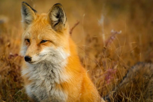
<section class="grid-cols rounded clip" style="--grid-cols: 1; --md_grid-cols: 2; background-color: var(--surface-color)" aria-labelledby="split-banner-title">
	<div class="grid align" style="--align: center start; --p: 1.75rem">
		<div class="flow" style="--flow: 0.5rem">
			<h2 id="split-banner-title" style="--h-size: 1.75rem">Your fylgja, in code</h2>
			<p>Modern defaults, native elements, and nothing you did not ask for.</p>
			<p><a href="#" class="btn --primary">Get started</a></p>
		</div>
	</div>
	<img
		src="/images/placeholders/fox.webp"
		alt="An orange fox standing in tall grass"
		width="500"
		height="300"
		loading="lazy"
		class="w-full object-cover"
		style="--size-y: 220px; --md_size-y: 100%"
	/>
</section>
Usage
- Use
grid-colson the section with--grid-cols: 1and--md_grid-cols: 2, so the halves stack on small screens and split from the breakpoint up. - Keep the text block first in the source. That is the order it should be read in,
regardless of which side it ends up on. To move it to the other side, place both
halves with
--md_coland--md_rowrather than reordering the markup. - Center the text in its half with
alignand--align: center start, and pad it with--p. - Give the image
w-full object-cover, a fixed--size-yfor the stacked layout, and--md_size-y: 100%so it matches the text half once side by side. rounded cliprounds the banner and keeps the image inside the corners.
Anatomy
| Part | Responsibility |
|---|---|
.grid-cols |
The one-to-two column split and its breakpoint. |
Text <div> |
The heading, copy, and call to action, centered in its half. |
<img> |
The image half, cropped with object-cover. |
--md_col / --md_row |
Where each half lands, when it differs from source order. |
Accessibility
- Give the image real
alttext. Unlike an image banner, this photo sits beside the text rather than behind it, so it is usually content, not decoration. - Name the banner with
aria-labelledbypointing at its heading, so it is a region a screen reader can find and skip. - Keep the text first in the source and move it visually with
--md_coland--md_row. Reordering the markup would put the reading order out of step with the visual one. - Use a heading level that fits the page outline rather than picking one for size.
--h-sizehandles the size.
Variants
Image on the start side
The text stays first in the source and moves to column 2 from the breakpoint up,
with the image taking column 1. Both halves also set --md_row: 1, since auto
placement alone would drop the image to a second row.
Built on what browsers already do
Dialogs, disclosure, and form controls stay native, so behavior is not yours to maintain.
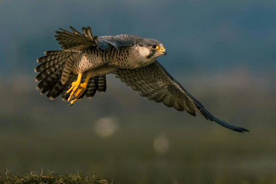
<section class="grid-cols rounded clip" style="--grid-cols: 1; --md_grid-cols: 2; background-color: var(--surface-color)" aria-labelledby="split-banner-reverse-title">
	<div class="grid align" style="--align: center start; --p: 1.75rem; --md_col: 2; --md_row: 1">
		<div class="flow" style="--flow: 0.5rem">
			<h2 id="split-banner-reverse-title" style="--h-size: 1.75rem">Built on what browsers already do</h2>
			<p>Dialogs, disclosure, and form controls stay native, so behavior is not yours to maintain.</p>
			<p><a href="#" class="btn --primary">Read the docs</a></p>
		</div>
	</div>
	<img
		src="/images/placeholders/falcon.webp"
		alt="A falcon in flight over open ground"
		width="500"
		height="300"
		loading="lazy"
		class="w-full object-cover"
		style="--size-y: 220px; --md_size-y: 100%; --md_col: 1; --md_row: 1"
	/>
</section>
Examples
For text over the image instead of beside it, use the Image Banner. For a banner with no image, use the CTA Banner.
FAQ
How is this different from a media card?
A media card is one item in a list, sized to its content and framed as a card. A split banner is a page section, so it runs full width, splits evenly, and carries a heading and a call to action.
How do I put the image on the left instead?
Keep the text first in the source, since that is the order it should be read in, and place both halves explicitly. Set --md_col to 1 on the image and 2 on the text block, and --md_row to 1 on both. Without the row, auto placement only moves forward, so the image lands on a second row instead of beside the text.
Why does the image not stretch on small screens?
It does not need to. Below the breakpoint the banner is one column, so the image gets a fixed height through --size-y. From the breakpoint up, --md_size-y of 100% makes it match the height of the text half.
Can the halves be uneven?
Not with grid-cols, which splits into equal columns. For a 2 to 1 split, set grid-template-columns yourself on the section, or drop the image to a background with the Image Banner instead.